Blog
27-04-2024
ODS:
World Design Day
Today, April 27th, we celebrate the World Design Day by sharing a personal reflection on the importance of including accessibility and equality in design as mandatory criteria in the creative process. I will also try to convey my personal experience at the "Multimodal solutions to foster accessibility in digital products and services” workshop by DIGITALEUROPE.
Reading the European Accessibility Act (EAA) helps understanding the objectives and needs of regulated and mandatory integration.
What the act proposes is for digital accessibility to be considered an obligation by all those responsible for producing websites, applications, digital tools (such as AI) and other services that we take as a guarantee, which means, creating an industry that seeks not only to support equal access but also to increase the scope of its services and informations- a mutual victory with: social inclusion, market expansion, corporate responsibility and innovation.
DESIGN’S RESPONSABILITY
Design being a fundamental area of communication, especially visual communication, the impact the decisions made in it’s process have, on the quality of the user experience, is enormous. On World Design Day, we seek to celebrate a design that is inclusive and accessible to everyone, including those with visual, auditory, motor and cognitive limitations - responsibility of designers and everyone involved in the process.
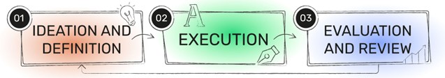
How can we ensure this?
Throughout the various stages of the design process (image below) we are able to ensure the informed inclusion of these users. For example, in the first phase of the process we can include as a criterion the question, is this idea accessible? and we will recognize new limitations and solutions; in the execution process is where these solutions should be implemented (what for the common user may be a detail in a product, for a special user may be the difference between its usability); The last phase, in my opinion, is where the inclusion of accessibility as a criterion is the most fundamental (the evaluation), because if everything else fails, in the previous phases, an inclusive review of the final result will make all the difference in ensuring this equality.
In practice, on the first phase, issues such as which typographies are inclusive can be explored, most studies point to the preference for typographies sans serif (since the ones with serifs have excessive adornments and reduce the readability); the levels of contrast between elements and images; and the complexity of both navigation and color palette are some examples of common problems. The remaining phases should ensure that the solutions found are applied with the necessary quality and with careful evaluation and review.
THE DANGERS OF A NON-INCLUSIVE DESIGN
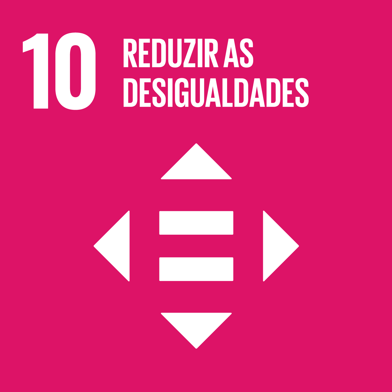
The devaluation and lack of knowledge about accessibility results in a design that does not respond to its users, which not only excludes an already fragile audience but also creates an opening to question the execution method, which can pass as unconsidered and question the overall design quality. To better understand the impact of the absence of these considerations, I present below an example of a test between two logos with different levels of accessibility.
Note: the logos were selected because they are opposite in terms of level of complexity vs minimalism. The icon version of both logos was used for these exercise (versions without the text).
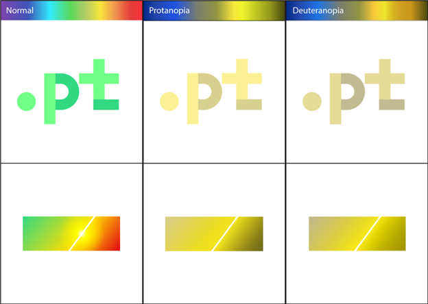
(The test was carried out with Adobe Illustrator - View > Proof Setup > Color Blindness)
Additional description: the focus of this exercise is on the way in which the representation/reference to Portugal is carried out in the first two logos, the "normal” ones (which are the current .PT logo and another made-up one). The .PT logo (much more complex in terms of symbolism and design) has references to Portugal in its name and color. The made-up logo sought representation exclusively through color.
The importance of this exercise lies in the conclusion that the logos that depend exclusively on the color palette to be identified fail when there are users with limitations in color visualization. On the other hand, it is possible to observe that logos that not only use colors but also other elements such as more complex shapes (distinguishable) allow for clear and confident identification of the brand and/or objective.
But what about identification through contour?
There are iconic contours such as the Coca-Cola bottle and logos such as McDonald's, however, this recognition is obtained through the use of a complex and unique shape, quite different from the competition, or a patent with strict image control (copies).
Considering this, it is safe to say that for the vast majority of projects a patent at this level is not realistic. Nor is it correct to use the gain of the icon status (at the level of brands like Coca-Cola) as justification to neglect the use of inclusive methods.
"There shouldn’t be a gap between the product and the service” – Bianca Prins
At the DIGITALEUROPE’s workshop about the "Multimodal solutions to foster accessibility in digital products and services”, Bianca Princs explored the need to contradict the tendency to approach user experience without considering all the realities of post-production, creating a separation between what the product is (design) and it’s service (the real applications). "It’s all about connection”, Bianca explains that at the end of the process what matters is can the user connect with our product?
A happy World Design Day and for more accessibility!
ODS:
Please note: the articles on this blog may not convey the opinion of .PT, but of its author.
Back to Posts